You’re not a robot,are ya?
UI/UX and branding for Open Source project called mosparo.io
In the beginning, there was...
Have you ever wondered how secure your data is today? And even when you check the „I’m not a robot” box, are you 100% sure what happens to your data? How exactly it is handled?
Are you getting angry each time they ask you if you are a robot? One time after another, selecting all those chimneys, crosswalks, hydrants, and other public space elements on a 3×3 image grid?
Finally, are you looking for a good solution to protect your website, application, login, or contact form from spam or brute-force attacks?
For all those reasons the tool mosparo.io was created. A simple and useful Open-Source tool for any digital product, 100% self-hosted with clear data handling.
I have the privilege to be a part of this project as a solo UI/UX designer. In the past few months, our small team reached the beta testing phase, with many positive reviews.
Branding
The tool’s name is an abbreviation of the words that explain the tool’s functionality – MOdern SPAm pROtection. But when I heard the name for the first time my attention was grabbed by the “-sparo” part. That’s when we decided to go with an animal-like icon. After some talks with the rest of the team, we also agreed to create a mascot named “Mo the Sparrow”. We definitely have some plans for it for the future.
mosparo’s Checkbox
But how should it work? At first, my idea for the easiest and cleanest solution would be – it should work automatically! With no visual representation. It should just protect, right? But the problem is – if we want to be compliant with the EU law, the user needs to manually agree to data processing.
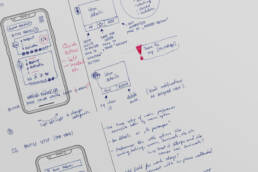
I created lots of options and different solutions, and then we tested the best ones with potential users. In the end, we decided to go with a simple checkbox design with the shortest possible text (according to our lawyers), and a design that’s universal and easy to fit into any product. Also, according to Jacob’s Law of UX, we chose the variant that is familiar to most users.
For now, you can customize the box to your needs, choosing from 3 pre-defined sizes, based on font size (12px, 16px, and 24px), and changing the colors of the background, borders, shadows, etc. to fit it perfectly into your product’s design. We plan to add more customization options in future updates.
One of the features that we incorporated into the cuztomization panel I’m most happy with, is the WCAG contrast ratio calculator, that helps users keep the correct ratio of the box elements when making their own changes.
Landing Page
In the landing page design, I wanted to create a simple, clear, and fun experience.
To achieve this, I created a set of 3d icons, used a limited color palette, and created a simple UI with a lot of whitespace. The main CTA is meant to point at our main competitor, and then lead the user to a description of why our way is a better way.
Right now we are in a process of adding dark mode to the landing page, it will come out live in future updates.
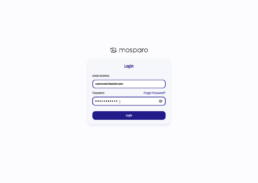
Application UI/UX
Right now not available in Beta Version, I’m working on the UI/UX of the app.


