Logo Collection
A collection of different branding works I've done so far over the years.
Featured works
Polcziken #kuryzrury

A personal idea for roasted chicken company branding.
Inspired by old polish trends of adding the “pol” prefix to make the company name sound professional. Since it sounds like “pole” in English, and the chickens are “pole dancing” when cooked, the result was fun and naughty.
Additional hashtag #kuryzrury (Chicken from the pole) rhymes and is easy to remember.
The design uses colors and shapes that refer to old PRL’s (Polish People’s Republic) style.
In PRL, there was a shortage of all products, and the government released cards which were given to people, so they could exchange them for goods. In present times almost all restaurants offer some kind of loyalty cards, to collect stamps or stickers to get n-th order for free or with a discount. Having all this in mind, I designed a loyalty card that’s reminiscent of old PRL cards.


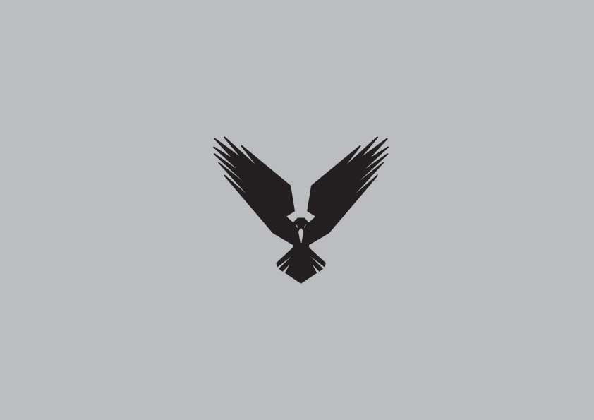
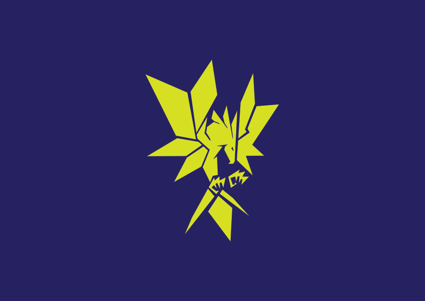
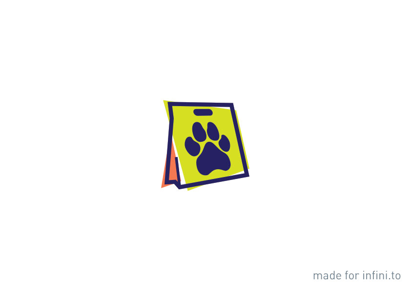
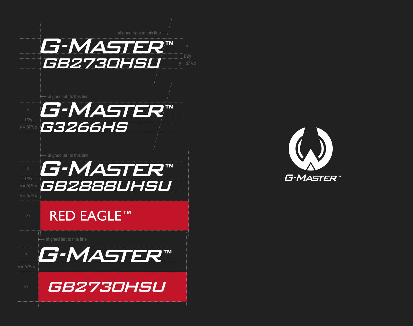
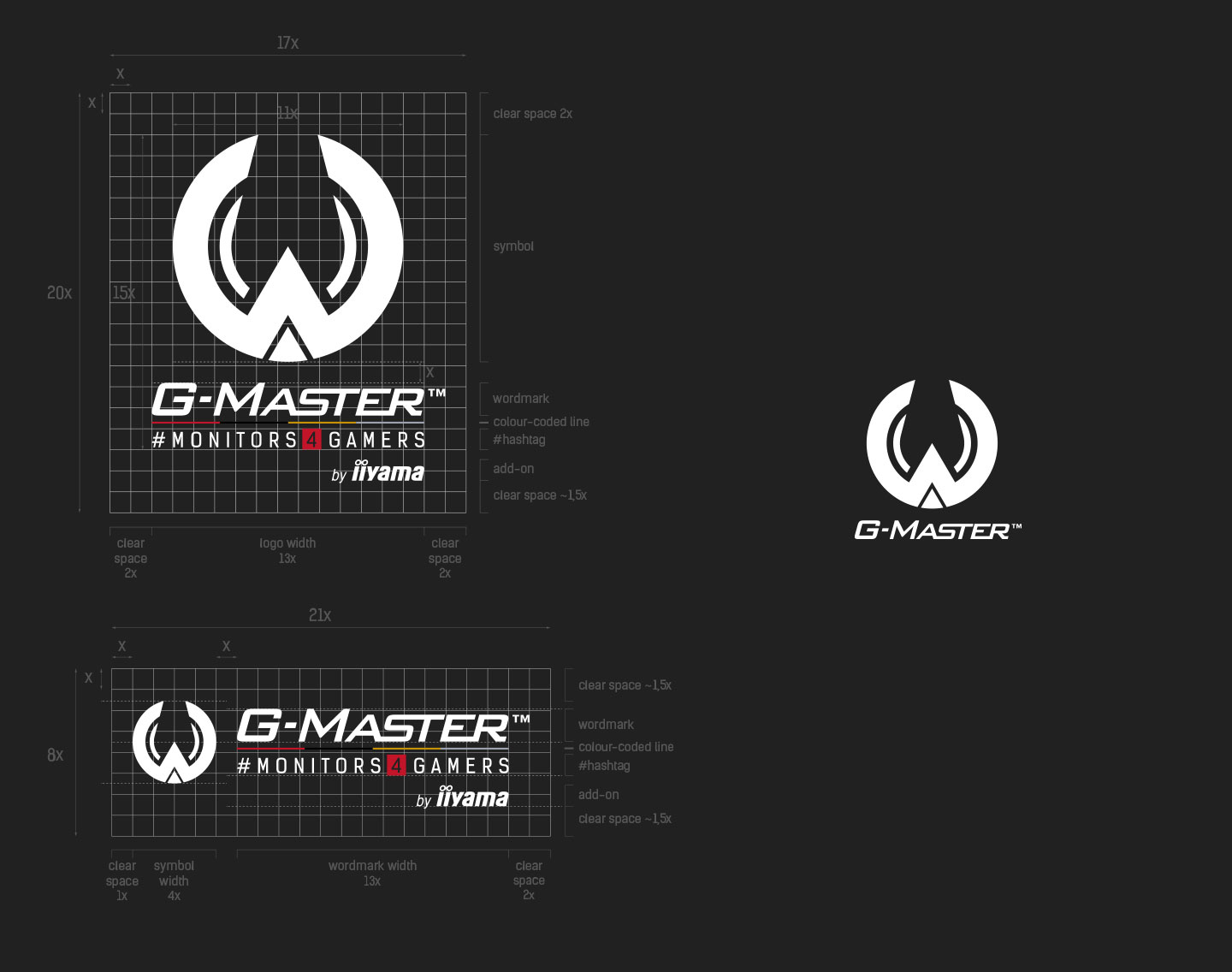
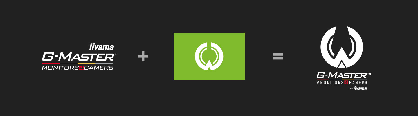
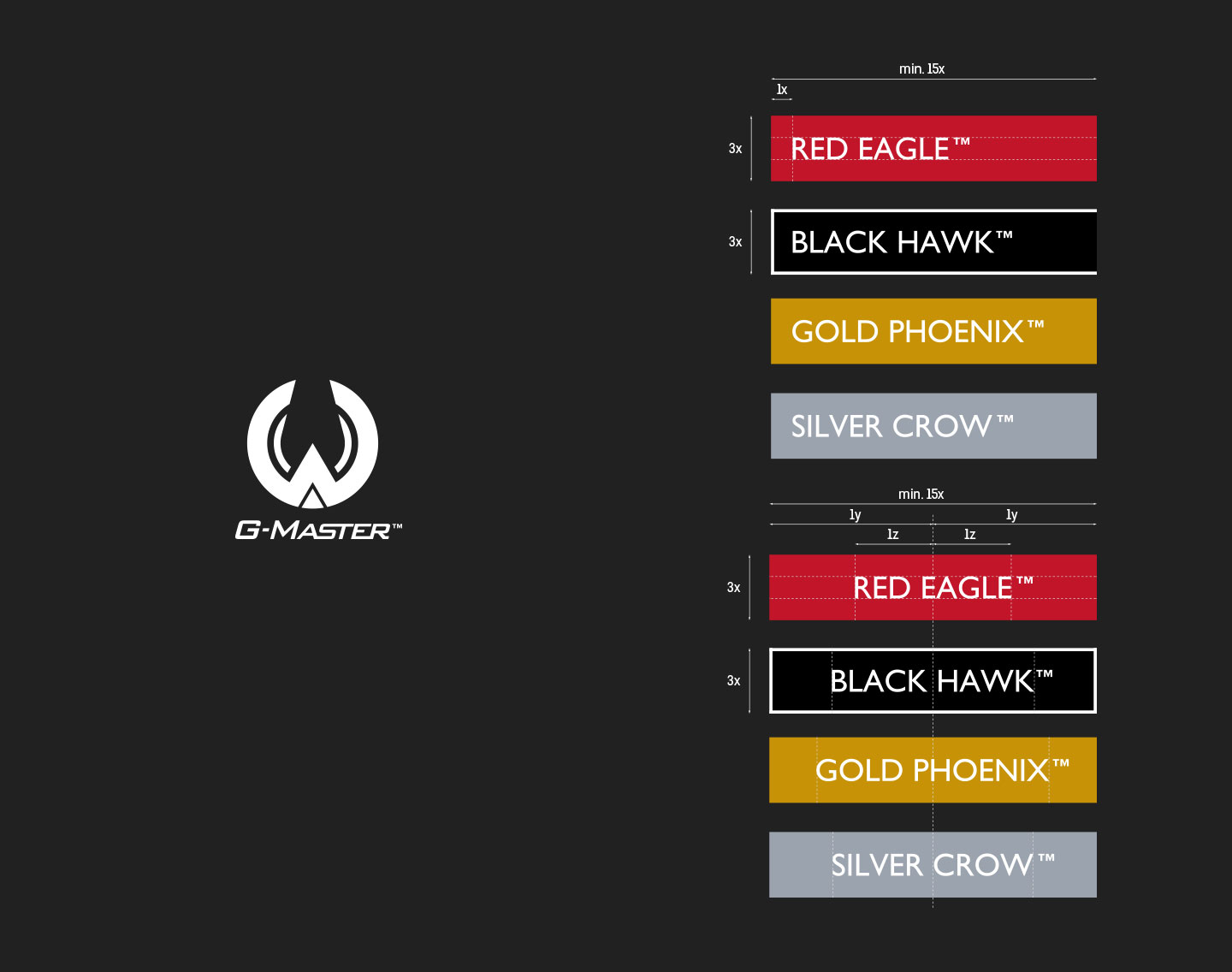
iiyama G-Master™

A project made for Agencja Interaktywna infini.to. G-Master™ is a series of monitors dedicated for gamers. It is represented by four clans: Red Eagle™, Black Hawk™, Gold Phoenix™ and Silver Crow™.
The new logo is based on the traditional symbol of the Iiyama city in Nagano prefecture (Japan). It also refers to the clans with its wing-like shape.
Rebranding consisted of:
1. creating a new logo for G-Master™ series
2. creating special versions for different usage
3. choosing right colors in RGB, CMYK and PANTONE™
4. standardizing the look of the clans (Labels)
5. standardizing product names
6. setting the rules of proper logo usage
7. creating simple brand book


Shotgun!

“Shotgun!” – that’s what one calls to sit in the passenger seat next to the driver.
I created this logo as a concept for a carpooling app. The barrel shape looks a bit like a car from the side.
mosparo

A logo of a very interesting web tool which is currently under development.
The name of the tool is an abbreviation of words which explain the tool’s functionality. But when I heard the name for the first time my attention was grabbed by the “-sparo” part. After some talks with the main developers, we agreed to create a mascot named “Mo the Sparrow”.
I cannot wait for the official release to write something more about it. To be continued.
Unicorns&Daggers

A personal project, branding for a tattoo studio and/or apparel brand focused on games, cartoons, fantasy, sci-fi and comic books.
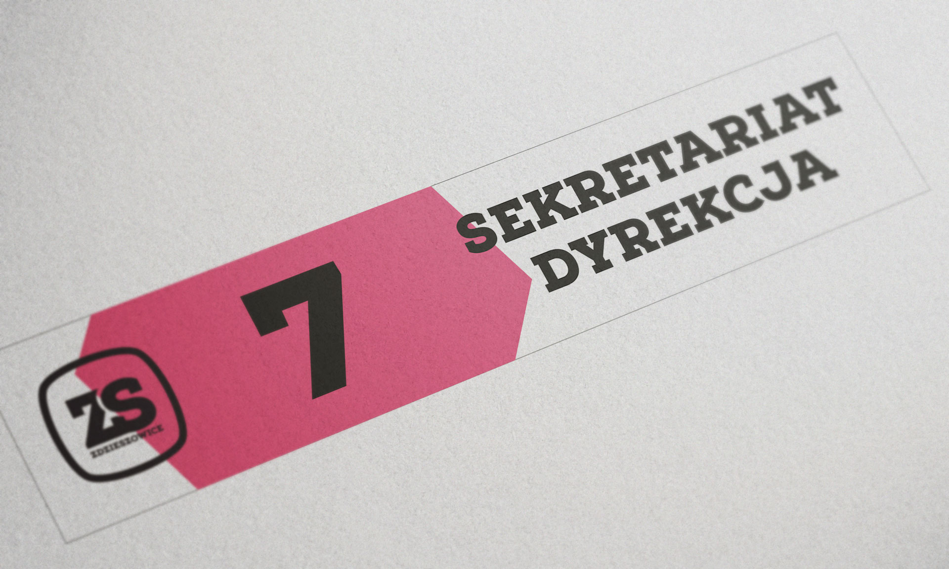
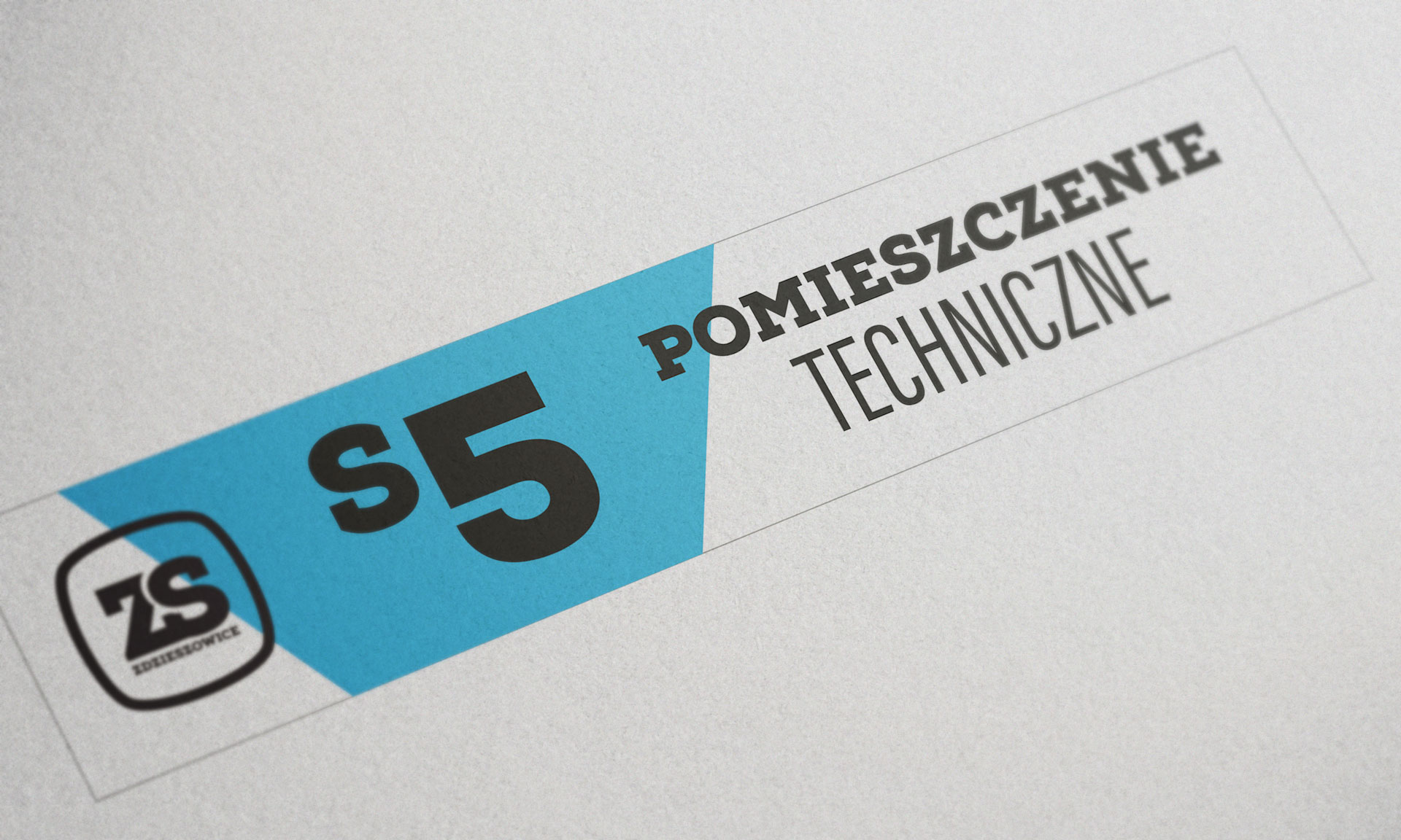
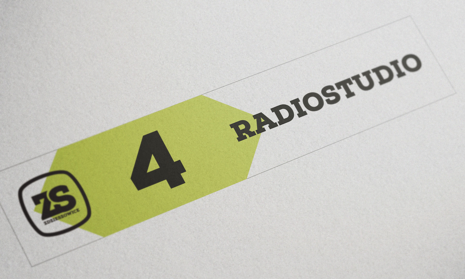
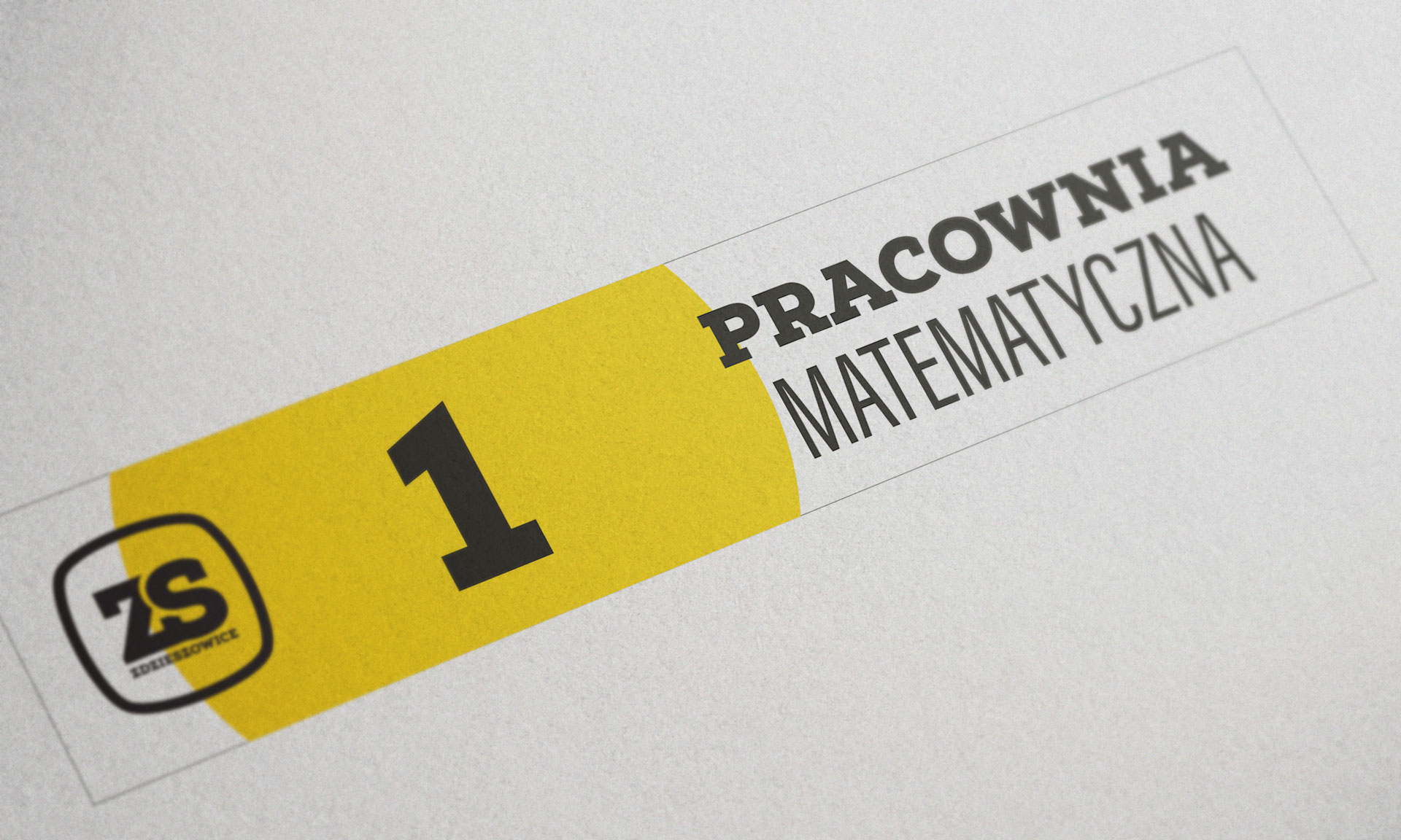
ZS w Zdzieszowicach

A logo created as a rebrand for school a in Zdzieszowice. Apart from the logo, I also created wayfinding elements and labels for the school’s rooms.
As a public school, it needs to be accessible by people with different visual impairments. The idea was to use different colors and shapes to distinguish a function of the room.


Other works