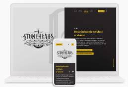
"Doświadczenie wykłute w skórze"
Design project of main website, for a Tattoo Studio based in Gdańsk and Wrocław, Poland.
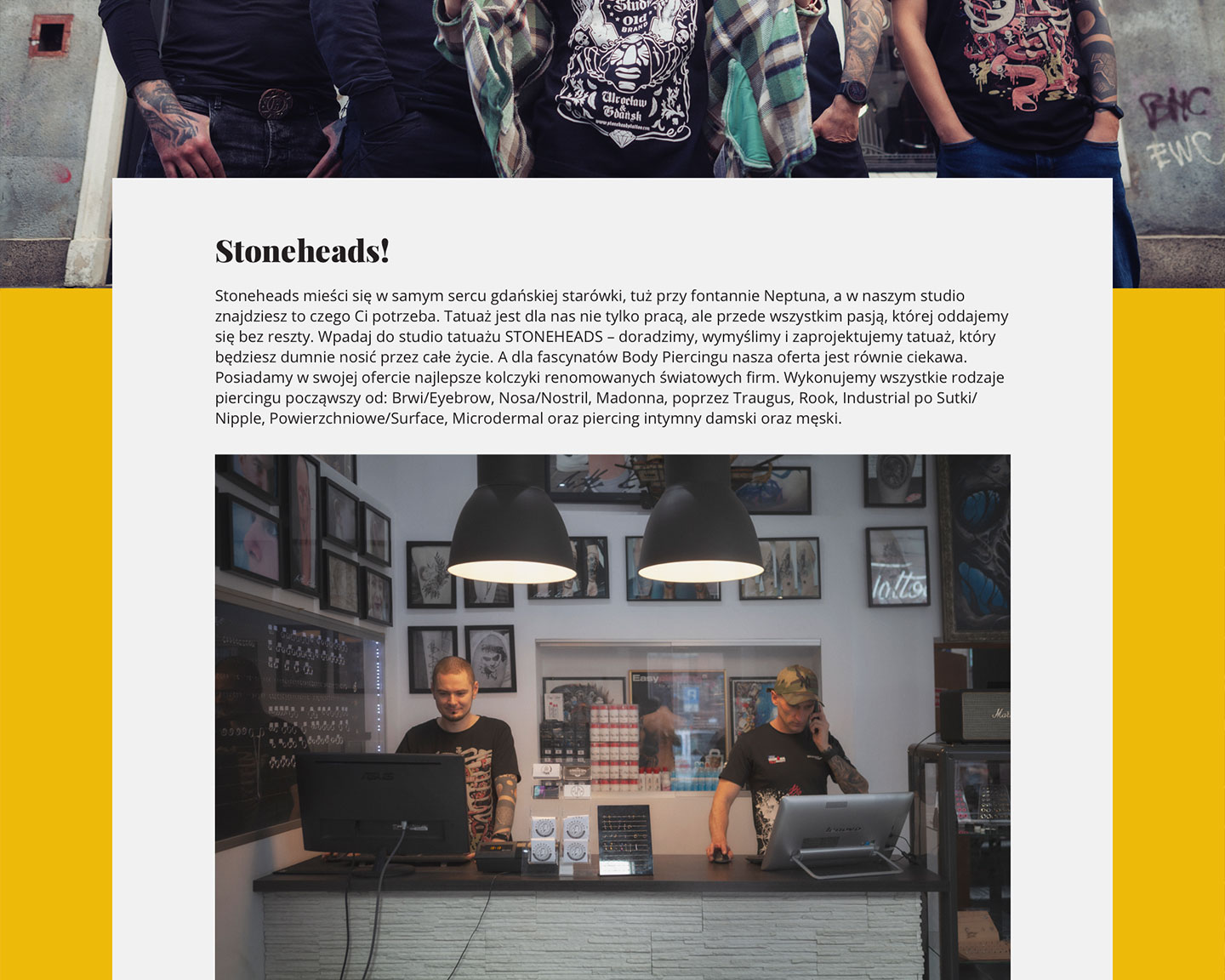
Carved in Stone
My process is always to start with research. Most do, right? But for me, it’s not about inspiration, color palettes, images, etc. It’s about associations. How does a brand work with its visuals and text content? Starting this project I had one question in mind – how to connect stone and skin decoration? Skin is soft, you can put the ink into it, pierce it through… but it is also our protective wall against the environment. OK, now we are getting closer to stone! There is an idiom “carved in stone”. It means something solid, unchangeable, permanent. By perfecting our craft, it becomes more solid too – and Stoneheads Tattoo Studio has been in existence for over 20 years, which makes it one of the oldest parlours in Poland!
Experience carved in stone. Good, but let’s go even further – in Polish the word “carved” and “pierced” sound almost exactly the same (wykute vs. wykłute). Since the idiom is well known, I decided to change one more thing… Since in a Tattoo Studio one works with skin, not stone, the final slogan translated to English would be “Experience pierced in skin”.
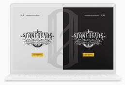
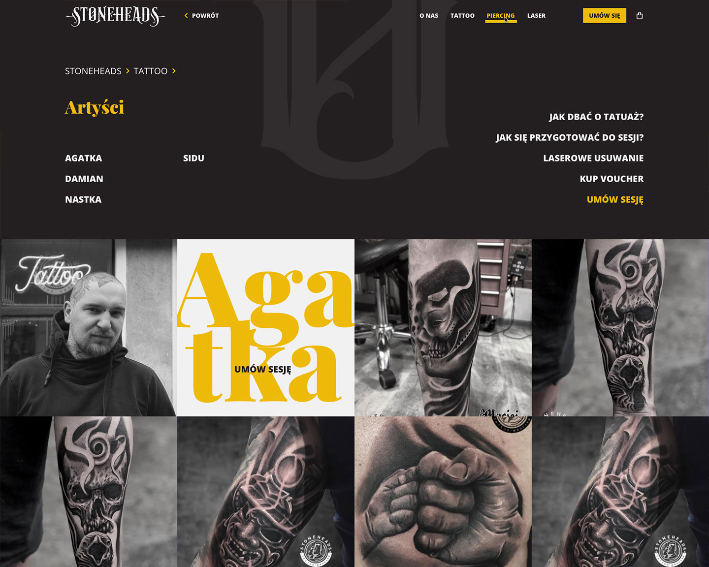
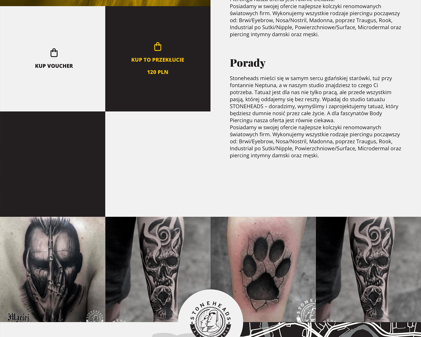
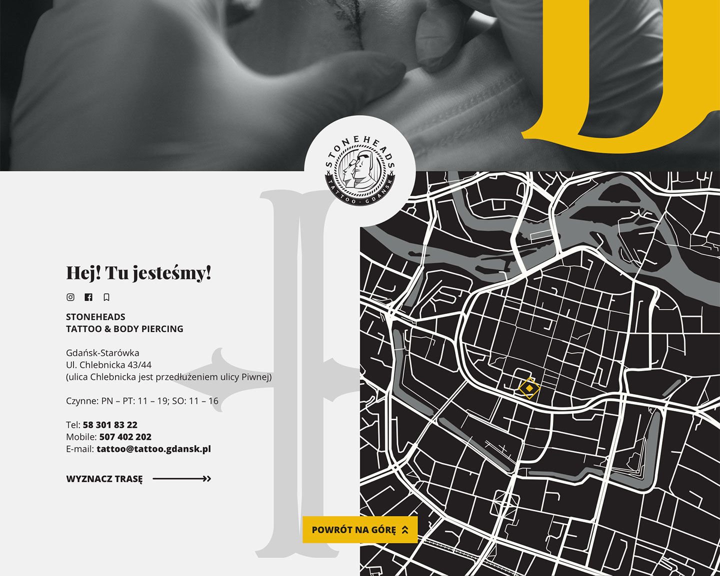
After that I had a clear vision of what I should design. Mostly monochrome (stone) with only one accent color (human element). For the human element, I chose yellow. It works best with black in terms of contrast. Just like people with tattoos and piercings are still standing out from the crowd. But we associate yellow with warmth and positivity. I believe that’s how society should look at people with body modifications, not as outcasts, which is unfortunately still quite common. I based the main layout on a checker design, with the clear sharp lines and high contrast it resembles rough stone, ready to be polished by a skilled artist.
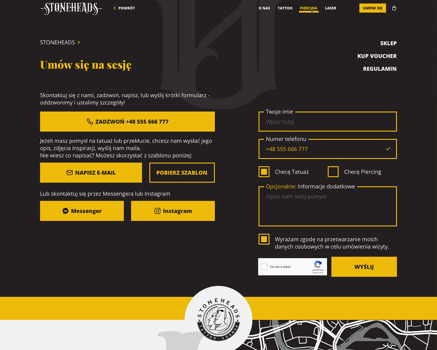
Stoneheads’ logo is very decorative. It creates a great contrast with the solid rectangular shapes of the layout. To break the contrast a bit, I’ve used letters from the logo as graphic accents throughout the whole website. Serif font in the Headings relates to the heritage, experience and tribute to the history of tattoo. Sans Serif font was used for content, enhances the legibility and brings the whole Brand into modern times. I divided the hero section of the home page into two parts, referring to the change that a tattoo brings into one’s life.

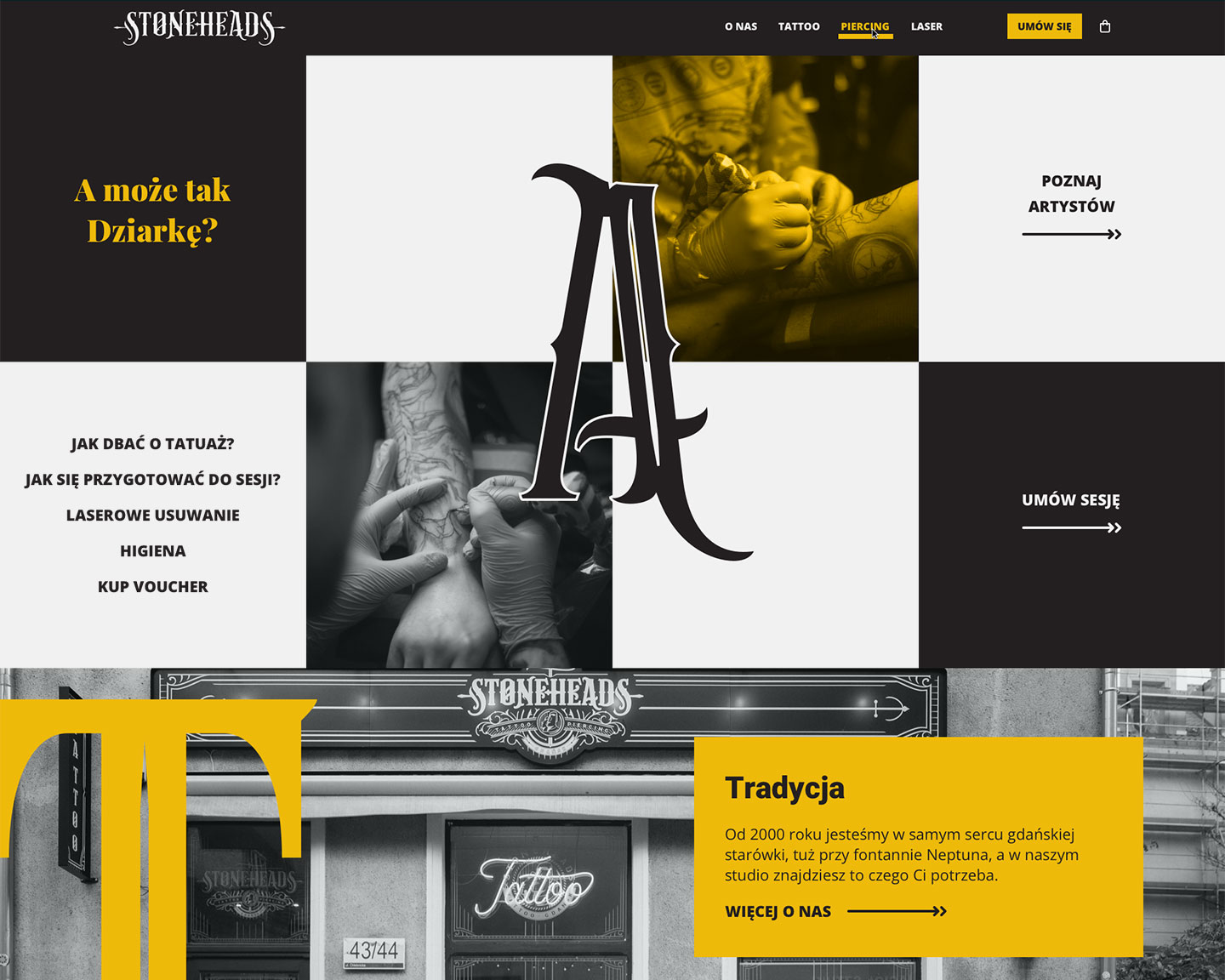
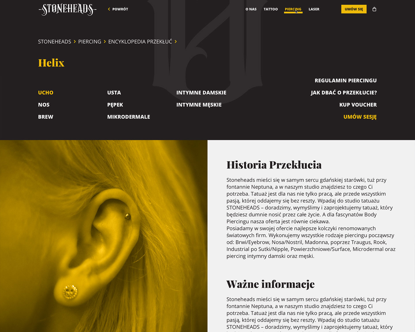
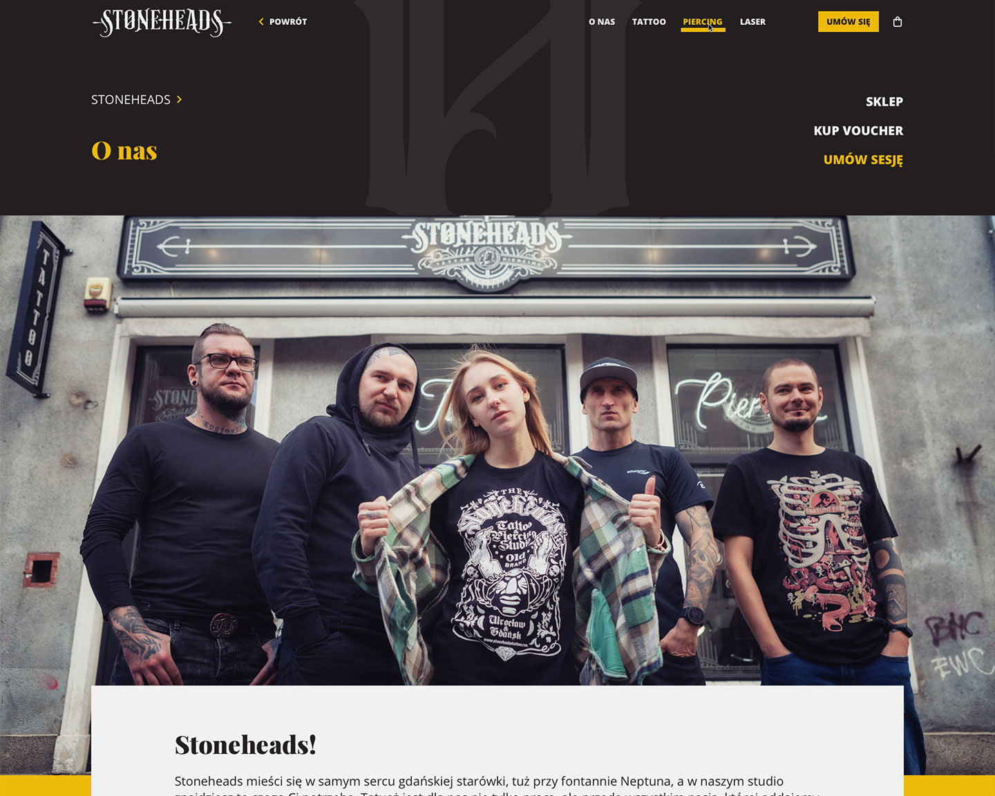
The heaviness of the design is intentional. I achieved it by using large, dark headers hovering over clean white spaces and rough rectangular shapes in contrast with thin and curved lines in the Logo, and irregular stroke widths in Serif Typeface.
Since Stoneheads Tattoo has its parlours in two cities in Poland (Gdańsk and Wrocław), I also created an intro page which will redirect users to the right Studio. This element will be created after both websites leave their development phase.