"Can we help youwith IT?"
Redesign project of main website, and two additional sites, Support Ticket System and Services' Status Overview. Plus some additional features.
Main Website
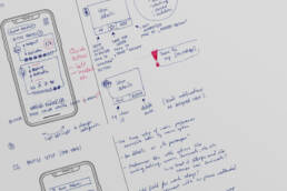
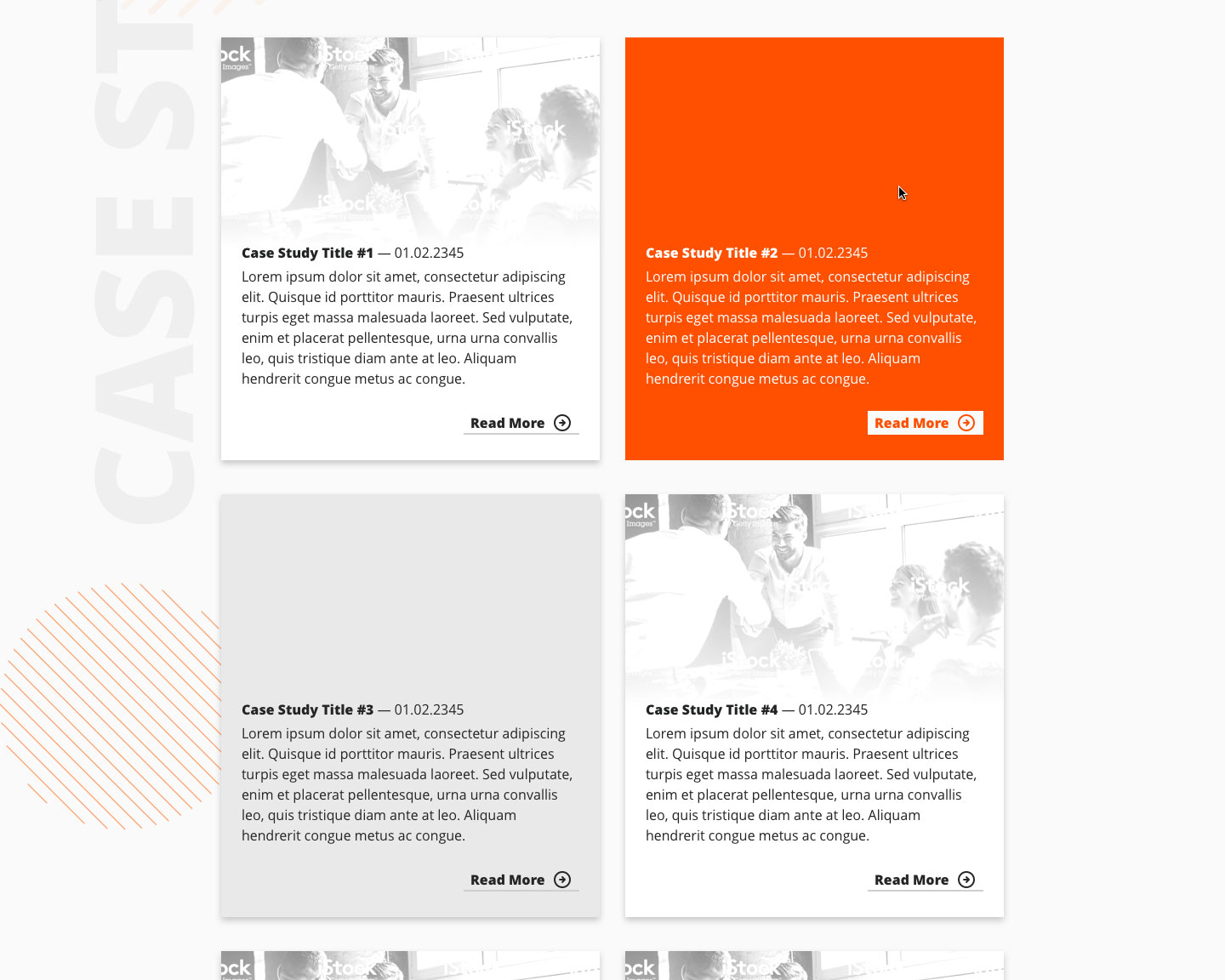
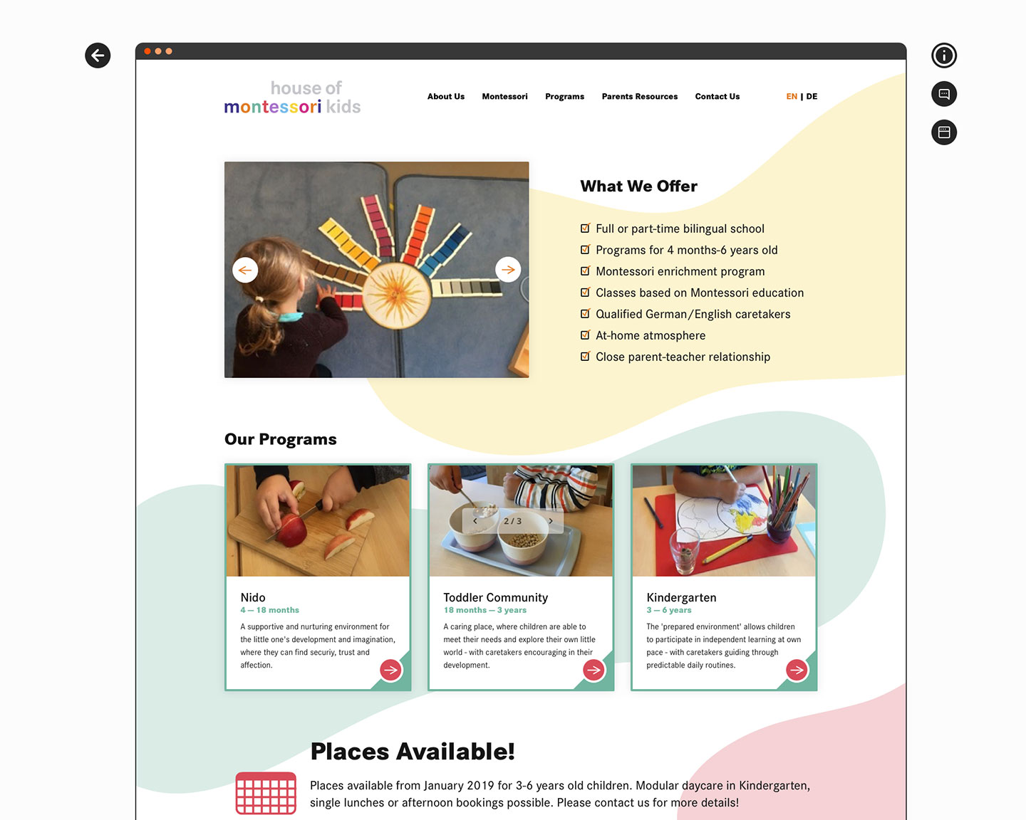
Since I joined promatrix in 2019, we’ve been discussing redesigning all our websites, to make them up to date with modern design trends. We started with the main company website, which shows all our Services, gives information about the company’s history, its team, and acts as the first line of contact for a potential client. After intense research, we settled on simple and spacious design, with a lot of flexibility thanks to a dark/light theme switcher. The main focus was to keep the structure of layout classic, but make it modern with a lot of whitespace and bold typography with several graphic elements adding a bit of flavour. We didn’t want to add too many bells and whistles, to keep the website as accessible as possible for any user.
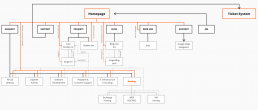

Even though the structure of the website is pretty simple, I created a structure diagram to keep everything organised. That also helped our developers to keep track of all interactions between subpages. In the end, we finished with more than 40 designed screens, both in light and dark theme, desktop and mobile. Here are some of them:

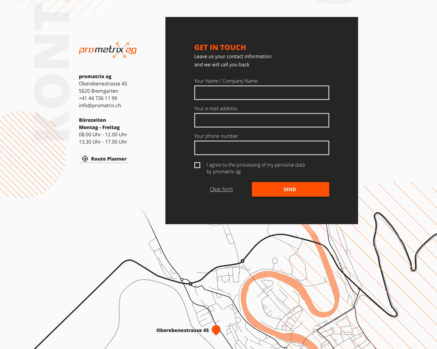


Many people use Google Maps on their websites, but not everyone knows that this is not a free tool. Its usage is limited, and although the limit is quite significant, it can be reached. When this happens, one can either pay for the map or have it displayed with an error message. Also, there’s the aspect of data privacy – thanks to Maps, Google gets a lot of data about the client’s users. That’s why I design a custom map for every project, which is accompanied by a link to Google Maps Directions, which makes it a perfect and safe combo.

Additionally I designed this very simple scroll microinteraction of parallax background elements.
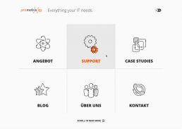
Custom Icons
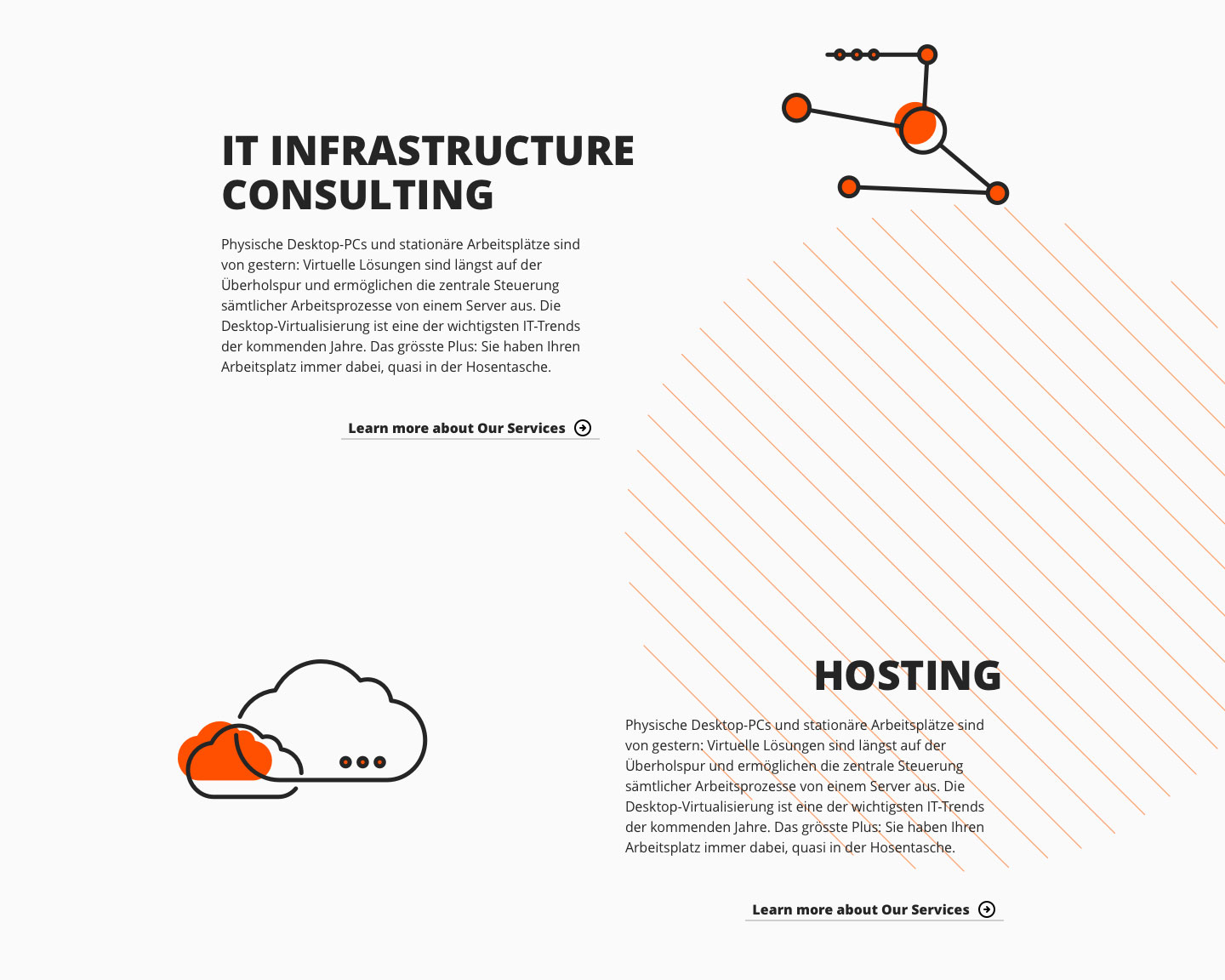
Custom Iconography is my favourite part of UI Design. It adds a unique look to each website, and makes it stand out from competition. Icons can also be used in printed media to spice up advertisements, flyers, posters, banners or office space. It’s always nice to have custom icons representing different services or departments of the company.
To make the website more dynamic, I animated the main icons representing the company’s services.
Helpdesk & Customer Support
Cloud Hosting
Graphic and Web Design
Software Development
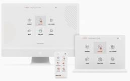
IT Infrastructure Consulting
Virtual Desktop
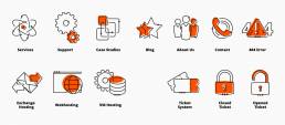
Icons are used in navigation, in the content to represent different parts of the page and also as a watermark in the top background of each subpage, which helps the user to find the way through the site.
But there is more!
Dark / Light
I personally use dark mode/theme wherever I can. There are many benefits, such as from lowering eye fatigue in the evening/night hours, and decreasing battery usage of mobile devices with OLED or similar technology displays. But they are not suitable for all people. That’s why we decided to include a theme toggle which allows each user to switch to dark or light theme according to their preferences.

We didn’t go with simple inverted colors. We tested a lot of color palettes, we wanted to add a little bit of playfulness to this part. The final palette gives a different flavour to the site, but it fits nicely in the overall company branding. So we decided to start using both themes for our YouTube Ads and printed media. Clear as night and day.
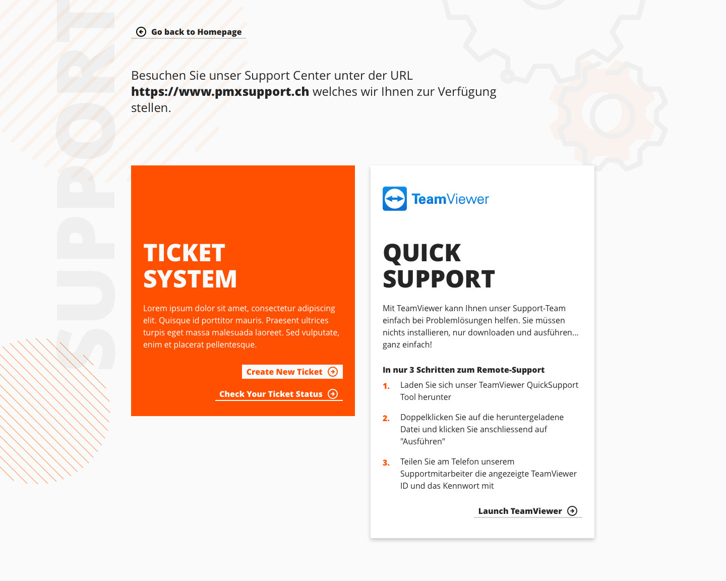
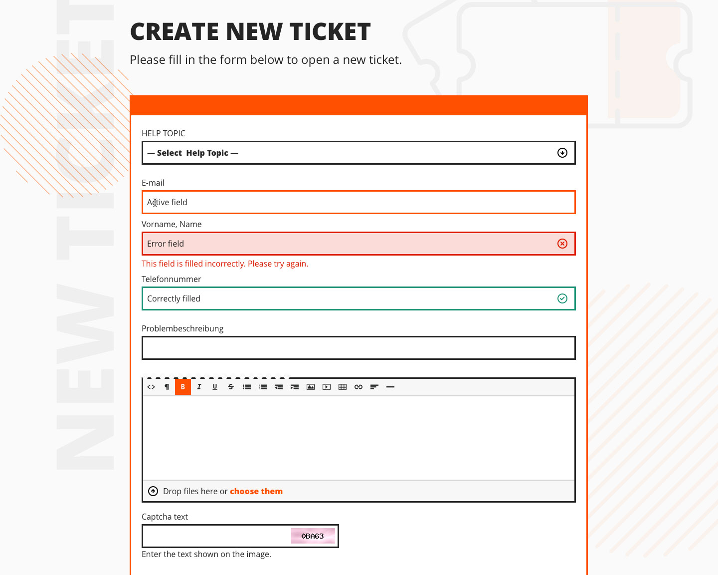
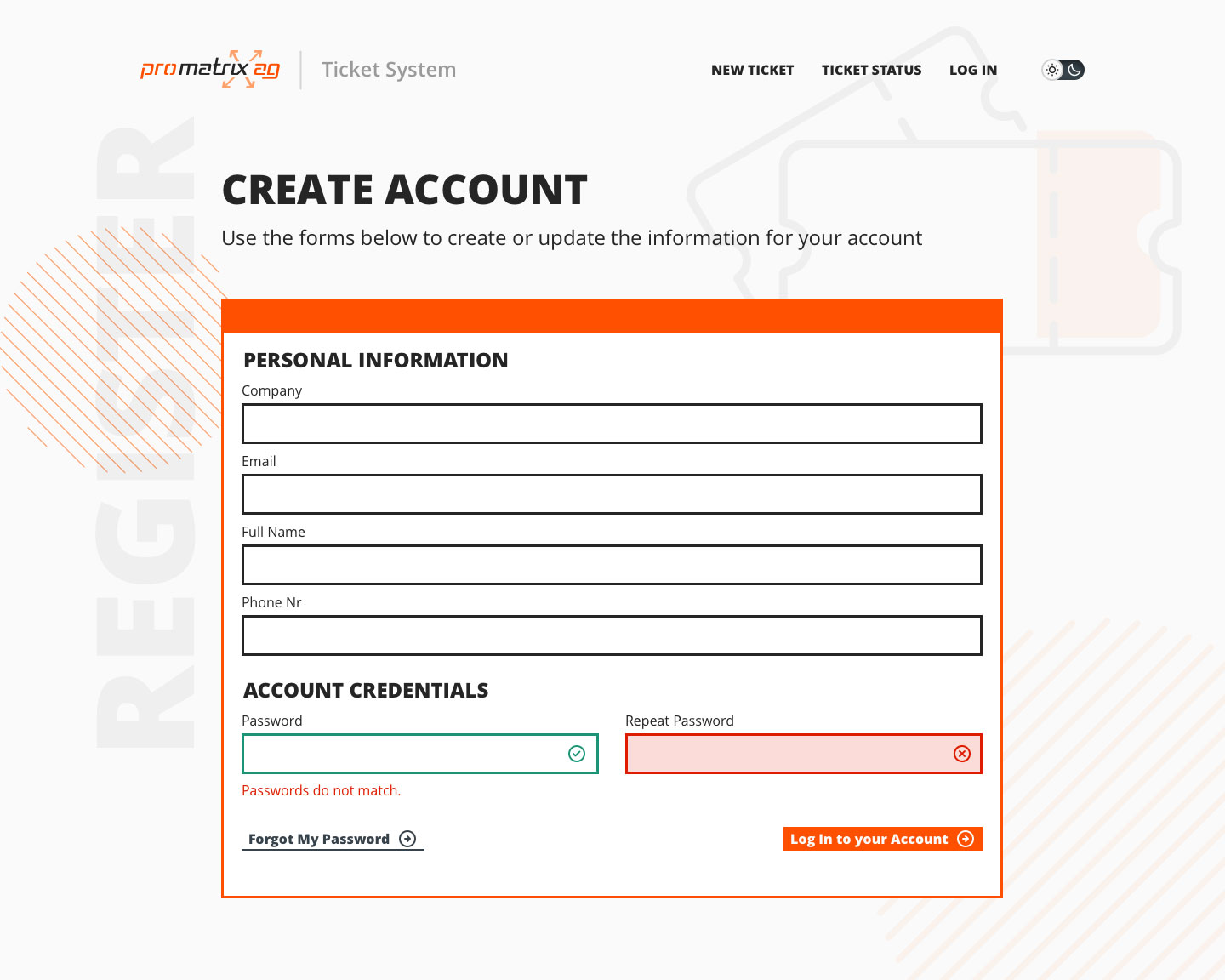
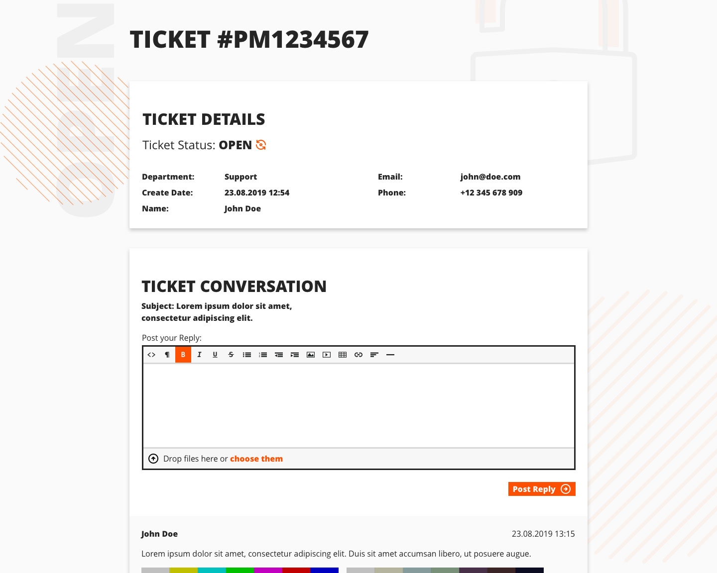
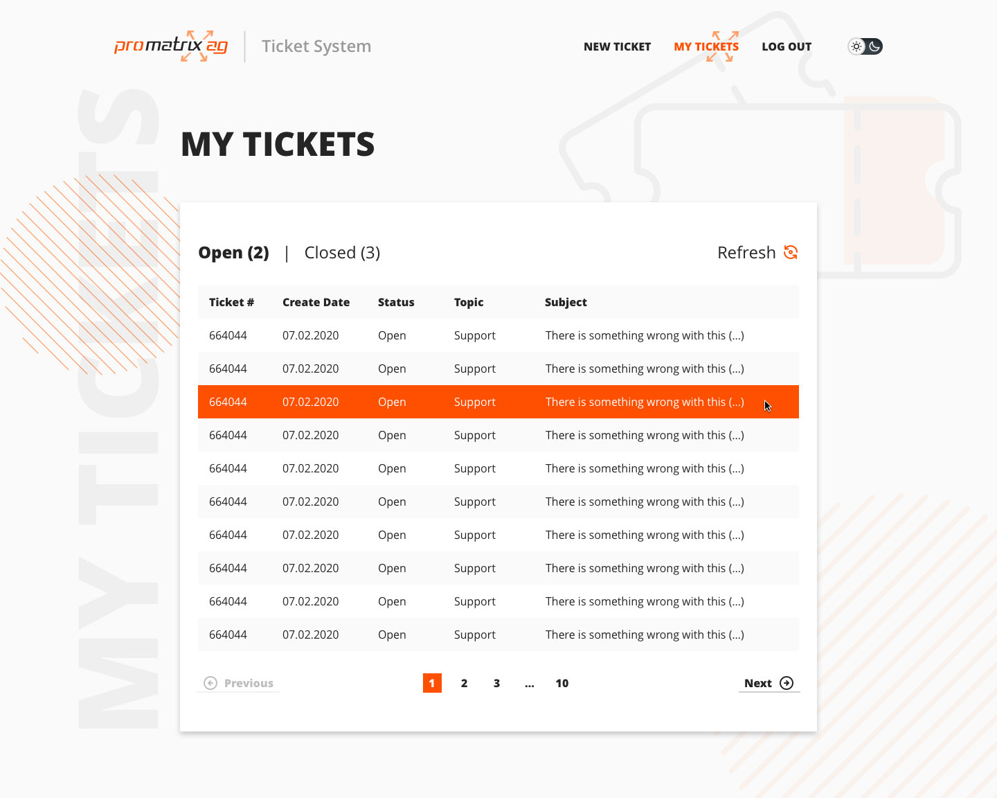
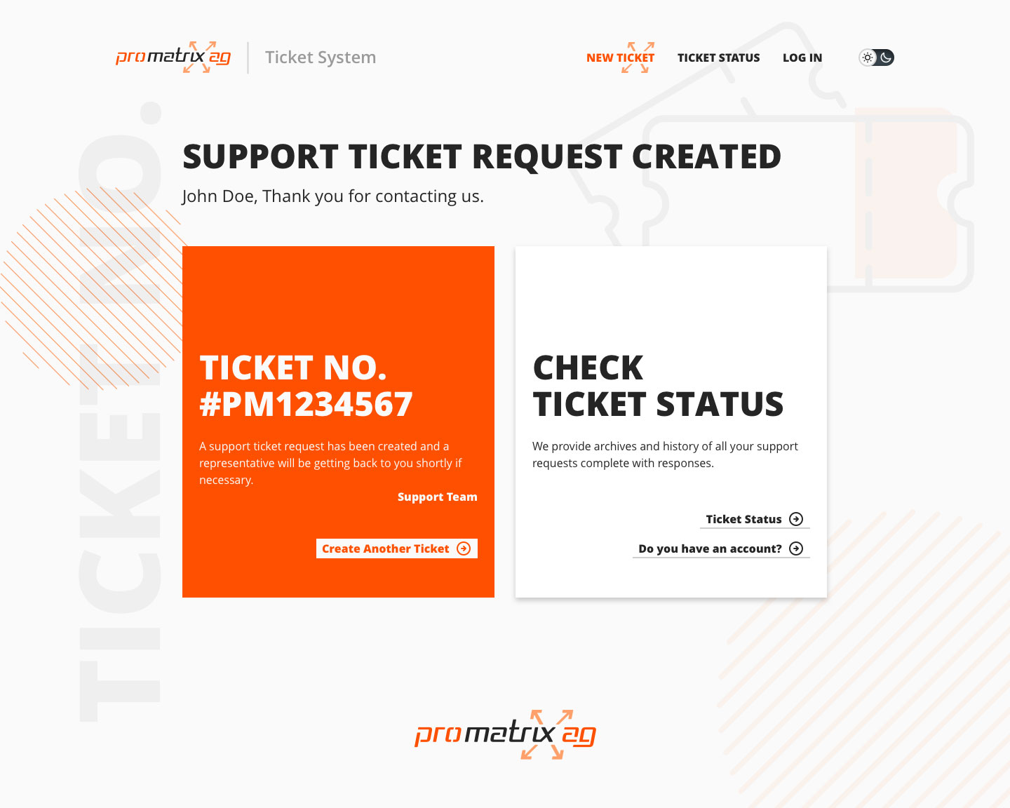
Ticket System UI
IT Infrastructures are the main core of our company. We provide help with selecting, purchasing, installing and maintaining IT infrastructures. Customer support is a big part of that, that’s why promatrix ag has a dedicated collection and management tool for Support Tickets.

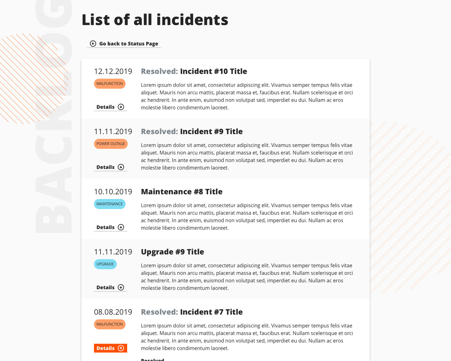
Status Check
With so many services, the company created its own status checking tool, which also needed a redesign to fit with its digital products. This simple page needed a bit more attention though.
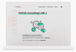
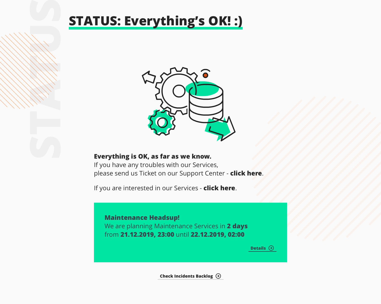
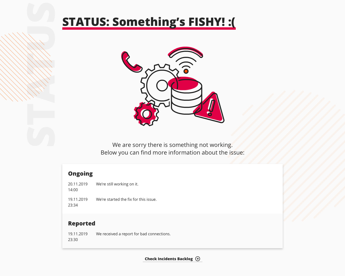
Adding more color and large animations at the start was a simple idea that worked out quite well. From the first glance the user could see if there is any problem with the services or not.


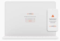
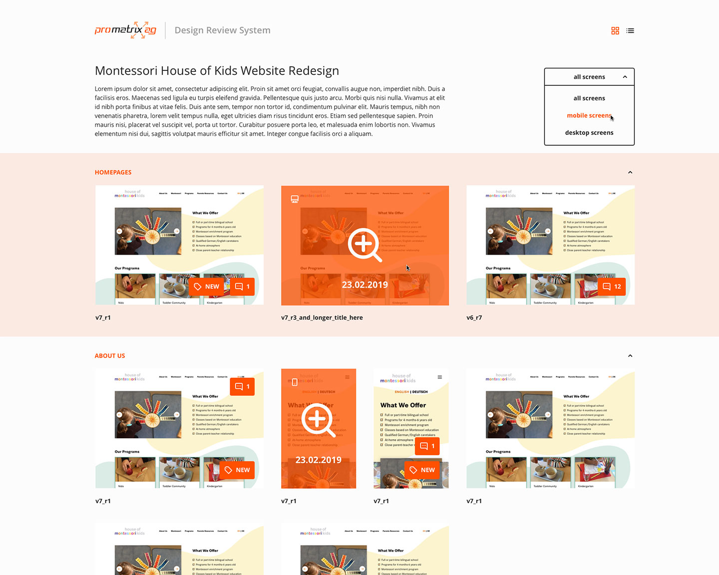
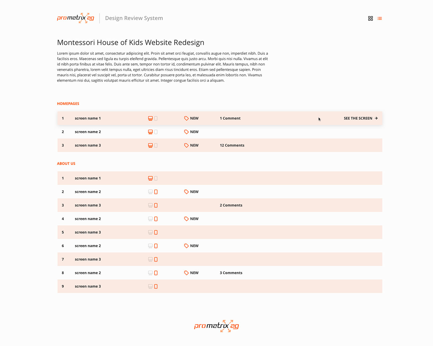
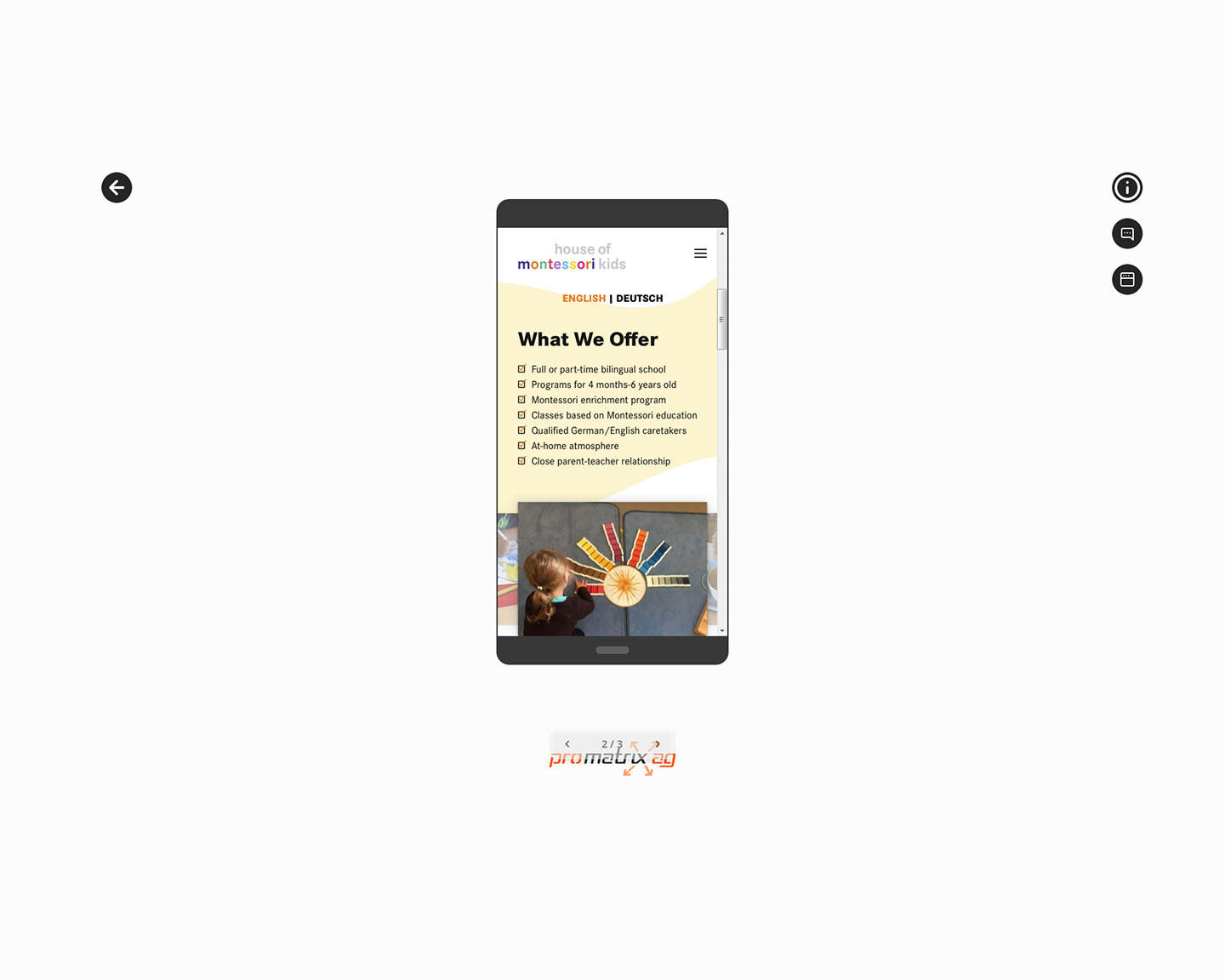
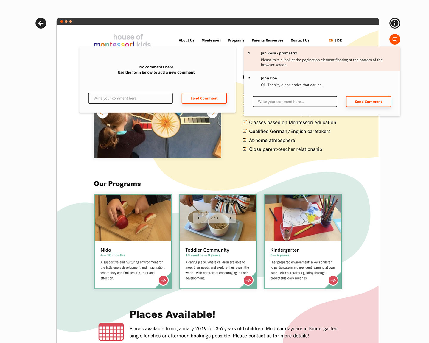
Design Review Tool
But IT Infrastructure is not the only thing that can be found in promatrix ag’s portfolio. There’s also digital product design and the development division. For this purpose we developed our own platform to share the designs we created with our clients and gather their feedback. Sure… we could have used one of the existing Apps, but having a tool of your own is much better, isn’t it?

Extra: YouTube Ads
One of the company’s services is Virtual Desktop. To promote this feature, especially in the time of the pandemic, we decided to launch a series of ads on YouTube. For this purpose, I created animations for some common uses of Virtual Desktop. Each ad was created both in day (light theme) and night (dark theme) versions.
Extra: Social Media Posts

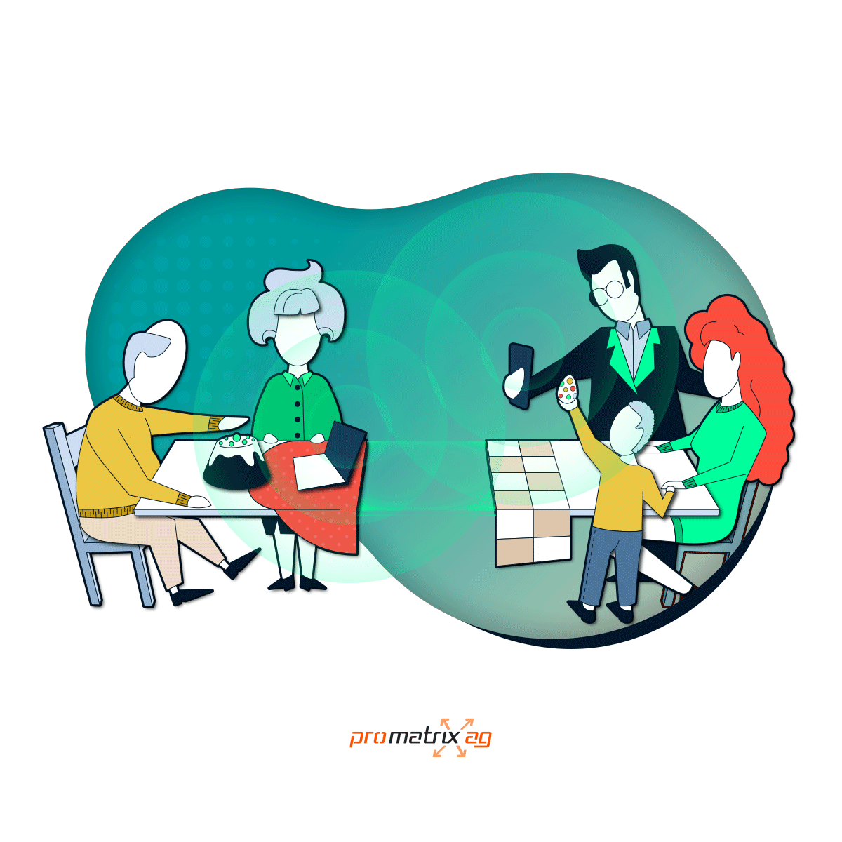


The pandemic changed the way we live, but didn’t change what we live for. Thank you for reading through the end of this project! Stay safe!